Tips & How To use the Dashboard globally
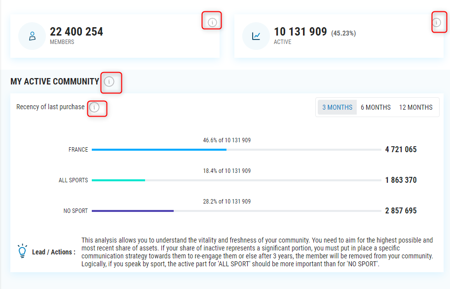
Use the “i” information
On each Tab, Sections, KPIs you have a “i”. When you put your mouse over, you will have a details explanations of each elements.

Use the “Lead / Actions” recommendation
On each graph you have some recommendation to understand how to use the different KPIs and which actions you can take to improve your KPIs

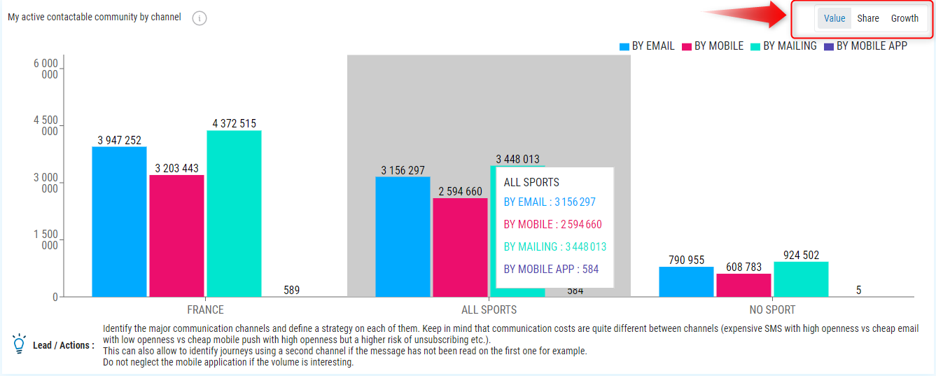
Use the selector (Value / Share / Growth)
On some graphics, you have the possibility to change the selector and to have :
- Value : It’s the volume of the indicator (Ex : 100K of active member)
- Share : It’s the share of the indicator in percentage. (Ex : 80% of active member)
- Growth : It’s the progression percentage of the indicator on a yearly basis (Ex : +2% of active member compare to the previous year)

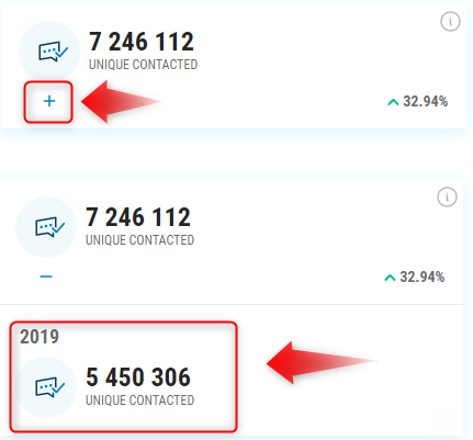
Have the previous period details
In most of the Highlight widgets in the top section of each page, by clicking on the ‘+’ you will be able to see the information from the previous period that was used to calculate the progression.

The difference between the 2 different progressions in a widget
In the Highlight widgets in the upper section, when they display rates (Open, Click, Reactivity) you see 2 different progression. The one in the bottom right corner shows the rate progression (2% –> 3% (in red on the example)). The one in the middle next to the volume indicates the volume progression (100 000 –> 110000) (in blue on the example)

Download the raw data
On some widgets, in particular on the tables in the Performance tab, it is possible to download the data in CSV to reprocess them in GoogleSheet for example. Each time you see the symbol highlighted in the example below, you will be able to download the raw data used to build this widget.

Multiple value filters
In the tabs ‘Performance’ and ‘Campaign Details’ you now have the possibility to select several values in the filters Sport, Sport Practiced, Classification. This allows you to have consolidated performances on several elements, or to output a part you are not interested in.
